
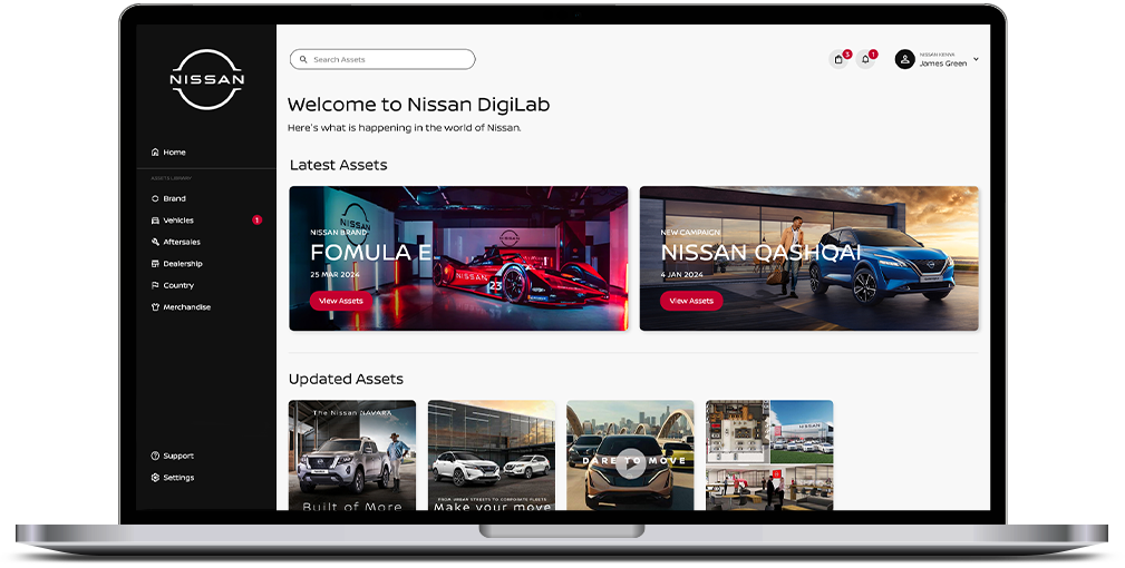
Nissan DigiLab
Nissan DigiLab is a brand assets management website that gives Nissan dealerships across the Sub-Saharan African region access to the latest Nissan brand assets and marketing material. The website was initially created to ensure Nissan dealerships receive the correct assets and communication material in order to uphold a global brand standard and create the right brand perception in the minds of their target audience. Since the launch of Nissan DigiLab, Nissan has seen an increase in band equity in the African market. However, the success of the new platform was short lived after a few months due to a decline in the use of the website and downloads of new assets.
Challenge
Nissan wanted to reevaluate the existing Nissan DigiLab to identify pain point areas where the overall user experience of Nissan DigiLab can be improved. In addition, a need was identified to improve and simplify the interface of the back-end dashboard of the platform that will allow anyone at Nissan and/or their advertising agency to easily use and manage assets on the site.
Solution
- Evaluate the existing Nissan DigiLab platform and identify areas where the product can be improved for both brand managers in our African countries and the back-end users of the authorized website.
- Based on the outcome and insight from my research (interviews and usability testing), design a new proses product that will address the needs and requirements for both Nissan and their dealerships in Africa.
Roles
- User experiences design
- User research and analysis
- Usability testing
- Userflow and prototyping
- User interface design
Tools
- Adobe Photoshop
- Adobe XD
EMPATHISE
Research
Since I have worked on the Nissan Sub-Shara African account in the past, I already had a broad understanding behind the reasons for the existence of the current website and the relationship between Nissan dealerships across Sub-Saharan Arica, Nissan HQ in South Africa and their respective advertising agencies.
For my research, I wanted to gain further insight into the users and how they use the current website in their various environments. I have set out certain goals that would guide my research process:
- Evaluation of the current website to identify challenges, areas of improvement and potential opportunities.
- Gain more insight into our target audience.
- Understand how our target audience use and navigate the website.
- Discover the needs, motivations and challenges users faces with the website.
- Align the users needs with Nissan’s business goals.
Current Website Analysis
With my research goals set, our first task at hand was to do a heuristic evaluation of the current Nissan DigiLab website. This evaluation will give us a better insight into the current system and to identify challenges but also opportunities that will help to enhance the usability of the product.
During the evaluation there were four main problem areas, in both the user and admin section, that stood out from the start:
- Overall information architecture of the website impedes on the user experience.
- Limited features and options to support the user to achieve certain objectives on the website.
- General layout of the website can be better utilised to improve the overall user experience.
- User interface across the website is inconsistent and not on brand.
Interviews
Now that I have identified certain problems areas on the website, my next step was to conduct interviews with our current users in order to validate my initial hypotheses and to accumulate additional information that may influence our recommended solution/s. During the interviews I asked open-ended questions to learn more about the different users, across different countries, gain more context around how they experience the usage of the website and to identify what the users truly need.
I conducted the interviews with 5 people, with a time duration between 15-20 minutes for each session.
Some questions asked during the interview:
- How often does your dealership use the Nissan DigiLab website?
- Tell me about your general experience and feelings when you use the Nissan DigiLab website?
- What external triggers or factors may influence you to use or not to use the website?
- What additional features or content would you like to see on the website that will support your dealership?
- Are there any additional information or insight you would like to share around how you view, approach and implement brand and marketing material, which may influence your usage of the Nissan DigiLab website?
Insights & Needs
Post interview completion, I went through all the new information, and created a summary to better understand our users. Based on the interviews, certain insights and needs were identified that are common among most of the interviewees.
Insights
- Dealerships only want assets and content that are applicable to their country, target audience and needs.
- Internet connectivity across the Sub-Saharan Africa may vary that could influence the usage and download of assets.
- Language barrier can be a problem which may influence how the user navigates and uses the website.
Needs
- Better navigation and structure of content, to help the user quickly find what they are looking for.
- Language options to navigate the website in the language they are comfortable with.
- Receive notifications for any new or updated assets.
- More country specific advertising assets to relate to their target audience.
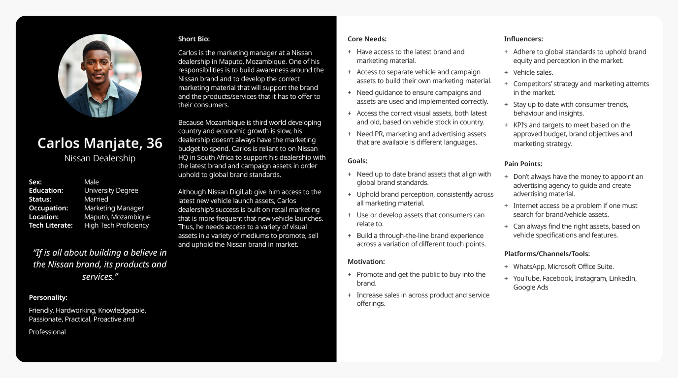
User Persona
Through all my research I was able to form a clear picture of who our targeted users are. By using this data an ideal user was created. They will act as a guide to help us make informed decisions and develop solutions that will address our user’s needs.
DEFINE & IDEATE
Defining the Problem Areas
After I conducted my research clear areas where the product and user experience could be improved were identified. The identified problem areas are the following:
- Navigation of website
- Website structure and information architecture
- Assets representation and file size
- Language preference
- Login process
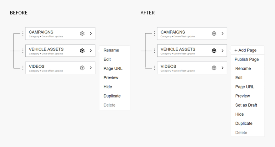
- Tools and options to have more control over the management of assets
Brainstorming
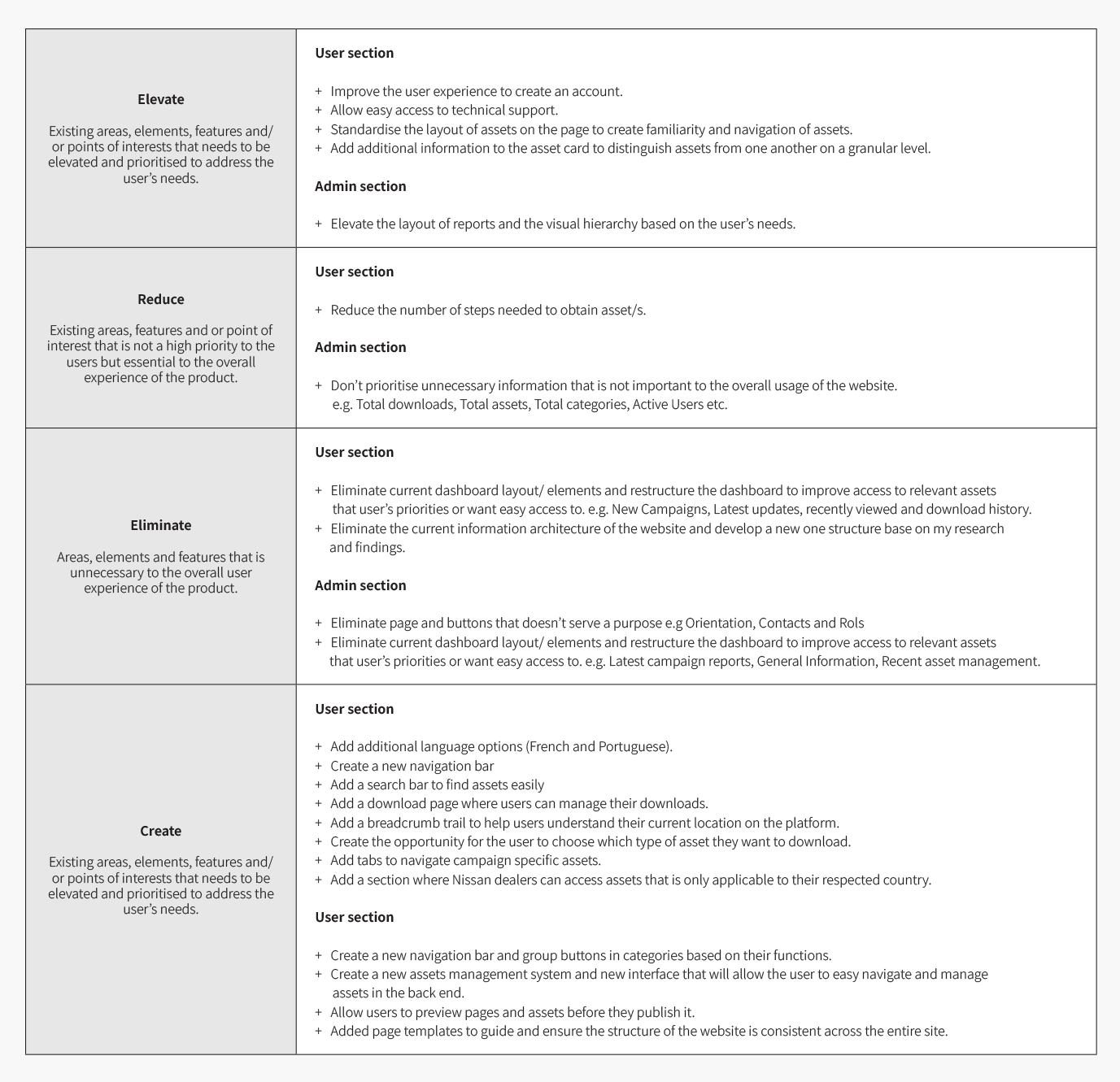
Now that I have identified the core problems areas, I started my brainstorming process to come up with ideas to solve the users’ need. To help me to structure and lay out all my ideas and solutions, I have categorised everything in the following four quadrants:
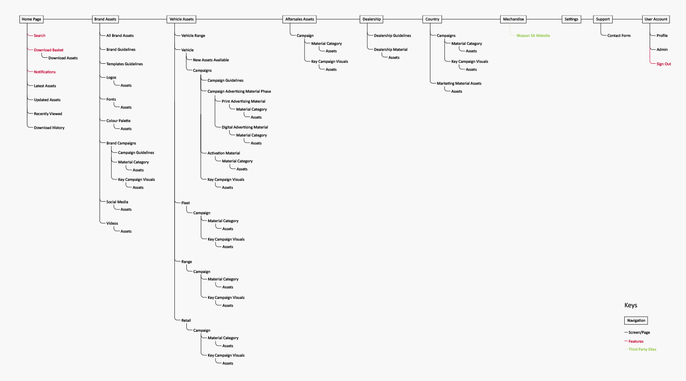
Site Map
Based on the research outcome and the evaluation of the previous site, I was able to create a site map to help me define a new overall structure that will improve the navigation of the website and the organisation of content based on the user’s needs.
Card Sorting
One of the key pain points in the current website is the poor navigation, naming conventions and location of assets. Because Nissan DigiLab has a large inventory of assets, we need to identify the best path to ensure the user can easily find what they are looking for.
I decided to conduct a sorting card session with 5 participants, in person, to observe and understand their thought process while they access a variety of different cards and how they group them together.
During the study I discovered three areas that led to the frustration and confusion in the usage of the current website. Firstly, participants struggled to group certain assets together, especially the variety of different vehicle campaign assets. Secondly, some participants struggled to find suitable names for certain card groupings for example, the type/category of campaign assets. And lastly, all participants had their own interpretation of the hierarchy of information and what they deem important or not.
After the card sorting session, there where clear thought patterns and common trends that emerged that enabled me to move on to the next step in the information architecture process to create the New Nissan DigiLab.
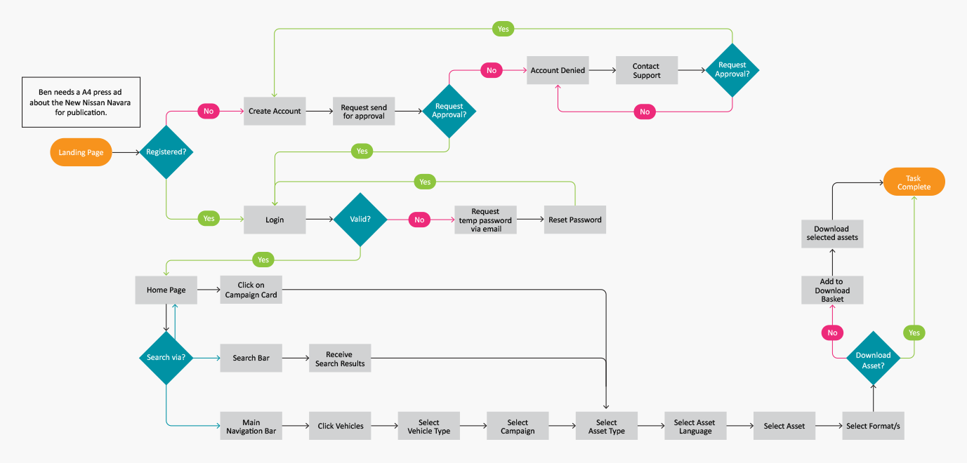
User Flow
Next, I wanted to get a better understanding of how my persona, Carlos, would navigate the website. The decisions he will make and the different paths he will take in order to complete a task and to meet his goals. I created a user flow diagram to help me identify all the actions, the key pages and features that he would interact with throughout the user journey.
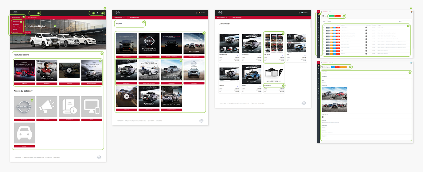
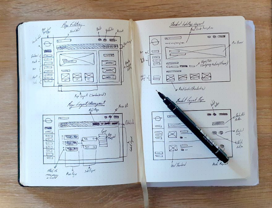
Low-Fidelity Wireframe Sketches
Now that I have a better understanding of the current website’s challenges, user insights and interaction and the overall architecture - I started to sketch out low-fidelity wireframe sketches to make informed decisions to find a suitable solution to address both the business and user’s needs.
PROTOTYPE & TESTING
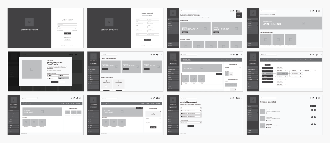
Mid-Fidelity Wireframing
To test my hypothesises and design solutions from my low-fidelity wireframe sketches, I used Adobe XD to create key mid-fidelity wireframes to help me layout my solutions and to identify areas where improvements are needed on both the functionality of the design and the user journey.
Usability Testing
Now that I have completed my prototype, it was time to conduct a usability test. For the testing, I developed a list of questions and tasks that I wanted participants to complete on the prototype. I then recruited participants for the usability test, to see how users navigate and interact with my design solutions. Throughout the session, participants were asked to think out loud and to share their feelings and thoughts while they were completing certain tasks.
Test Objectives
- Test if people can easily complete certain tasks.
- Observe how users navigate the website
- Assess potential areas and features to improve the usability of the website.
- Identify any additional insights that will improve the product.
Tasks
Users, for both the front and back end of the website, where asked to complete tasks such as:
- Find a certain advertising asset in a specific file type.
- Find the latest brand campaign.
- Change the language preference of the site.
- Create a new website page.
- Edit a website page etc.
Overview
Method: Remote, moderated usability testing (Think Aloud)
Participants: 6 (2x NCS, 2x agency staff, 2x Nissan staff)
Average time: 10 minutes
Task Completion Rate: 100%
Error-Free rate: 97%
Outcome & Revisions
The outcome of the usability testing showed an overall positive result for the new recommended version of Nissan DigiLab. A few areas were identified that needed adjustments. Some users also gave additional insights and recommendations that could further refine the user experience.
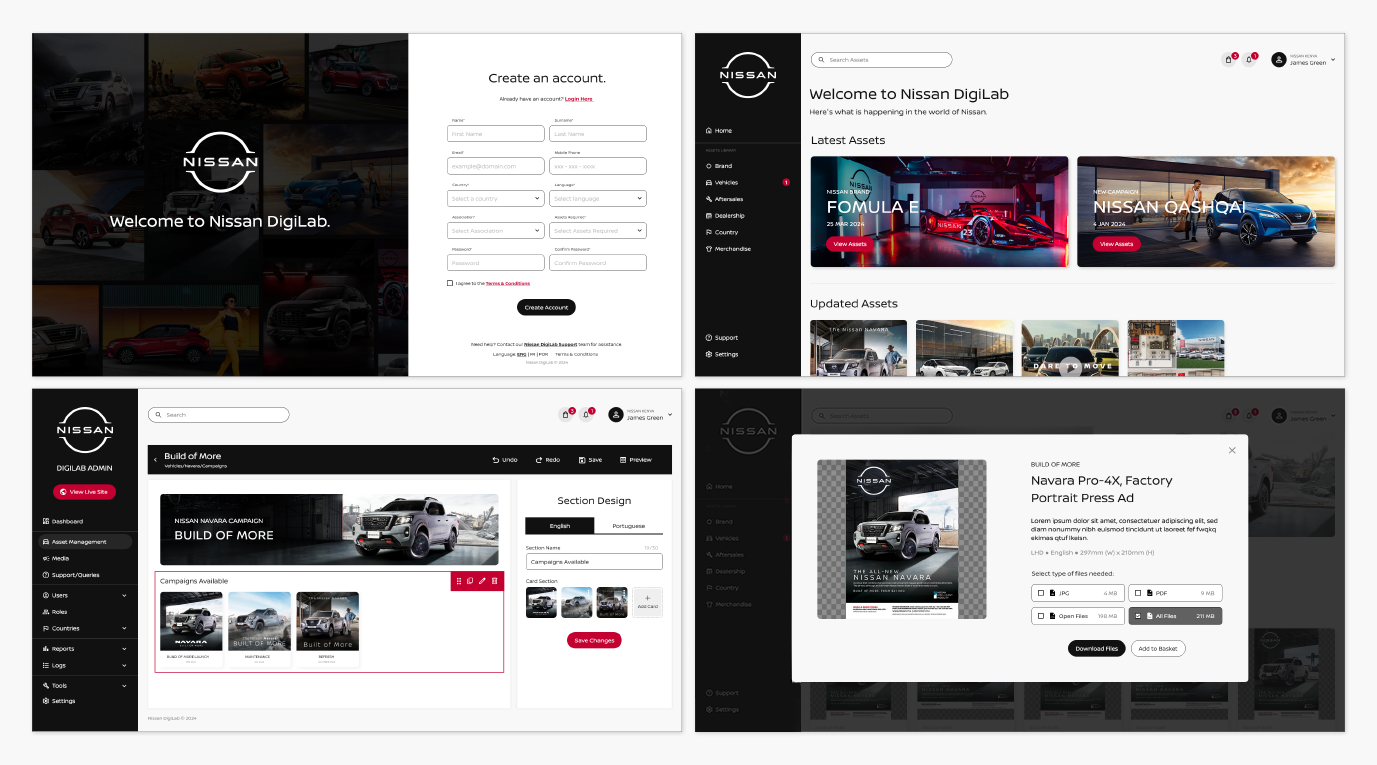
UI DESIGN
UI Toolkit
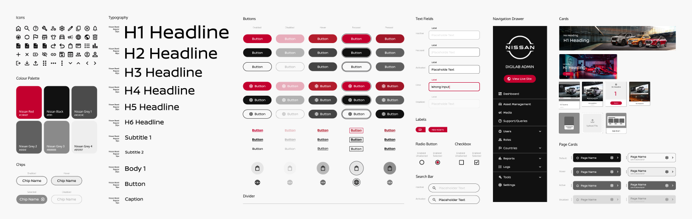
One of Nissan’s business goals is to ensure that the new Nissan DigiLab conveys the brand’s personality and a perception of value. I have used Nissan’s brand standards manual as a guide, to design a compilation of different UI components, templates, styles and resources that will enable me to design the user interface of the new website.
Now that I had sketched out my ideas, I wanted to test the decisions I made and make sure that the structure and flow of the app is intuitive for our users.
High Fidelity Wireframing
After I incorporated Nissan’s brand identity into a standardised UI toolkit, my next step was to use my revised wireframes to design high-fidelity wireframes for the final prototype of the new Nissan DigiLab.
Next Steps
During my case study, I have only focused on certain areas that I have deemed important to improve the general user experience and journey of the website. There are a couple of additional steps needed to ensure the project can be handed over to the development team.
+ Re-Testing
After I made the revisions, applied the new visual style and components to my prototype, I want to conduct another user testing session to validate the changes made and to identify if there are any additional improvements needed.
+ Design Handoff
With the finalised version of the design there where minor changes. I presented the final design and my recommendation to stakeholders. The project was shared with other decision-making stakeholders for approval and final sign-off, before it will be handed over to the developers to build the new Nissan DigiLab website.
Key Takeouts
After the completion of the project there were key takeouts that stood out and played an important role in the final recommendations of the new proposed Nissan DigiLab website. These key takeouts also served as learnings that I can take into consideration for future product design projects.
Small changes can make a significant difference.
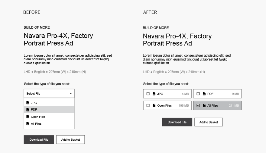
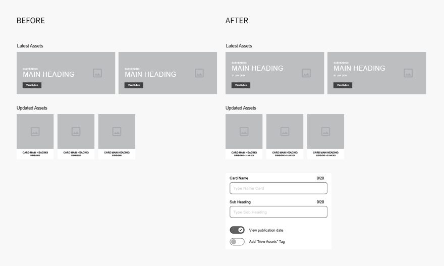
At first glance, the project may look like a simple, but simple serves a purpose. During my research I came to realise how a variety of external factors and the environment in which the product is used can influence the user experience of a product. The smallest change like showcasing the date or the size of a file can determine if people will use a product or not.
Options can lead to confidence in a product.
During the user testing sessions of both the current and the new recommended website, the impotence of giving users options made a huge difference in how they felt, approached and navigated each respective website. I realised that there needs to be a balance when we provide options to our users. Too many options may be overwhelming, which in turn could lead to confusion and indecisiveness, while on the flip side of the coin too little options may lead to frustration.
The perception of value.
During my last user testing session, there was an extremely positive response to the final high-fidelity prototype. The users were eager to explore the new website. The changes made to the user experience was welcomed and we found users spending more time simply enjoying and exploring the site's features. The users’ reaction highlighted how a consistent visual style an overall aesthetics can contribute the overall user experience of a product. Leaving a lasting impression that the product is an asset which in turn translates to a perception of value.
