
GripBox
GripBox is a conceptual gym management and data capturing app that is designed for the CrossFit market. The core purpose of the app is to elevate the CrossFit experience and to connect people that share the same passion for the sport.
Challenge
There are a lot of different CrossFit data capturing apps, on the market. Although each one has their own focus and differentiating factors, not a lot of CrossFit gyms make use of these apps. While there may be multiple reasons for this, a lot of individuals still use their mobile phones to capture their results. Which unlocks the following questions. Why do people not make use of an app? Are there alternative solutions to solve existing needs? And are there any undiscovered features or unsolved challenges that could elevate the usage and experience of the app?
Solution
- Research the CrossFit industry to understand how people think, feel and behave in this environment.
- Identity potential solutions to address people’s needs and challenges.
- Design an app that can be easily adopted by both the coach/owner and its members.
- Brand identity to reflect and communicate GripBox’s unique personality.
Roles
- User experiences design
- User research and analysis
- Usability testing
- Userflow and prototyping
- User interface design
- Brand development
Tools
- Adobe Photoshop
- Adobe XD
EMPATHISE
Research
Since I am familiar with the sport, being a CrossFit athlete myself, I already have a good understanding and insight into the sport and reasoning behind its popularity.
For my research, I wanted to further delve into the overall CrossFit experience and view the sport from every possible angle. This will assist me to form a holistic picture on what is needed to develop a digital product that will enhance and elevate the CrossFit experience beyond the daily class.
I have set out certain goals and areas that I wanted to explore during the research phase of this project:
- Identify competitors and evaluate their strengths and weaknesses.
- Visit different CrossFit gyms to experience different cultures, their approach to the sport and to engage with members and their coaching staff.
- Interview a variety of different members and coaching staff so that they can share their stories, views, motivations, goals, challenges and their unmet needs in the experience of the sport.
- Discover what digital products people use in this sport.
Competitor Analysis
Next, I shifted my focus to identify competitors within the CrossFit market. My goal was to gain additional insight into product trends, potential opportunities, and gaps within the market which I could use to my advantage to develop a solution.
Through my research I have identified three main competitors within the industry:
- SugarWod: An app that is all about community and fitness progress.
- Beyond the WhiteBoard: A popular, advanced tracking app for elite gyms and athletes.
- Wodify: Gym management system that is all inclusive, with the primary focus on the owner of the business.
Using both quantitative and qualitative research methods, I have looked at each one of the above competitors in order to identify their strengths and weaknesses, while keeping in mind GripBox’s objectives and vision.
Based on my research I was able to identify potential avenues for opportunities and to formulate several hypotheses around the usage of digital products within this market segment.

Interviews
With my competitor analyses complete, I wanted to gain a better insight into how people think, feel, and behave within the CrossFit culture and the experience that goes along with it. For my interviews, I decided to visit three CrossFit gyms. I strategically selected the gyms based on their difference in size, the number of members and coaches, gym experiences, gym culture and their geographical positioning.
During the interviews I have asked open-ended questions so that I can learn as much as possible in order to identify key moments that could unlock opportunities and what the user’s needs truly are.
I conducted interviews with 5 coaches/owners and 6 members/athletes that vary in their goals, views, and level of fitness.
Below are a couple of questions that I asked during the interviews:
- From the moment you wake up in the morning, please take me through your day and your journey before, during and after a CrossFit class.
- Why did you join CrossFit and what do you enjoy about the experience?
- What are the positives around the communication between you and the coaches/members?
- What are the pain points/ frustrations around the communication between you and the coaches/members?
- If you look at your daily CrossFit journey, are there any pain points or areas that could be addressed in order to improve your experience at the gym?
- Data capturing is vital to measure one’s progress in CrossFit. What tools or products do you use to capture your results?
- What media channels do you use to consume information about CrossFit or any related content?
- What digital products (hardware and/or software) forms part of your CrossFit experience?
After conducting these interviews, I took all the information gained and compiled it into a condensed summary to better understand who the ideal users are.
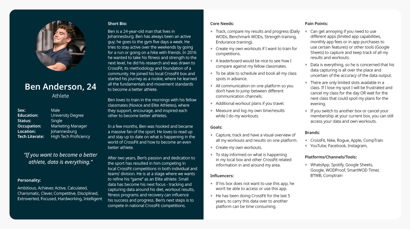
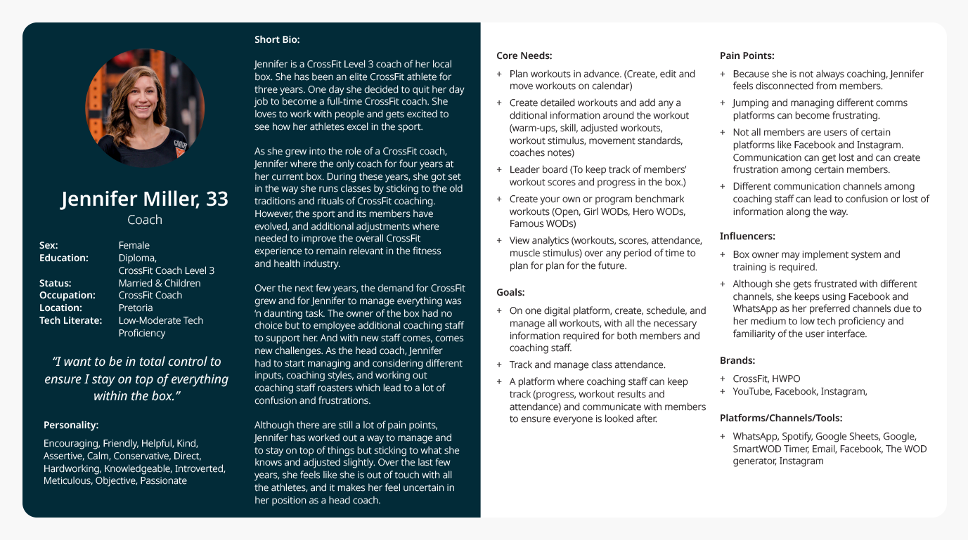
User Persona
Based on the completed research; I have gained a better understanding of who GripBox’s target audience is. Using what I learned, I was able to create user personas for both the owner/coach and the ideal athlete/member. These two personas will act as a guide to help me make informed decisions throughout the design process and to ensure my recommended solutions are centered around the user and the context within which this product will be used in.
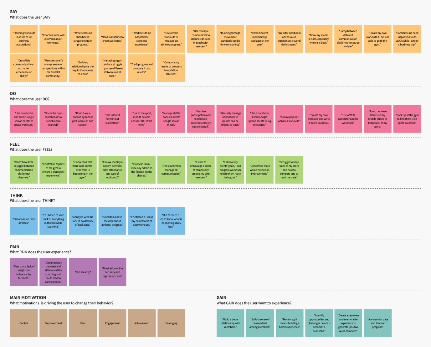
Empathy Map
After I conducted my interviews with various participants, I used an empathy map to organise and categorise all the information gathered. By categorising the information, I was able to gain a better understanding of how people within the CrossFit communities view their world, the way they think, feel and act. As well as what fears and needs they wanted to be address.
With my empathy map completed, common patterns emerged which helped me uncover key insights into what the user’s needs:
- Convenience & Simplicity: With so many moving parts throughout the CrossFit experience, people have expressed that they prefer information that is delivered in a simple and easily consumable way.
- Data tracking: For both the coaching staff and the athletes, data plays a vital role and a corner stone within the CrossFit experience.
- Environment: A lot of people have expressed how external influences before, during and after the CrossFit experience can have an influence on how they perform or behave.
- Relationships: Many people made comments on how being informed can influence their overall CrossFit experience at their gym.
- Scheduling: Although CrossFit boxes may vary in membership size and class capacity, securing a spot in class or planning a week can be an added benefit.
- Beyond the gym: People can become obsessed with CrossFit, they will do anything to get their hands on any additional workouts and/or programmes to improve their fitness or to maintain it while they are away from the gym.
Insights:
- Although CrossFit is associated with extreme fitness and elite athletes, 80% of global participants are novice or intermediate and their age can range between 18-70+. Based on past experiences and objectives, people consume content in a variety of ways.
- In the fast-moving pace of CrossFit, majority of the users want to keep it simple. Data/results must be easy to capture and easily accessibility.
- In the CrossFit environment, users, especially coaches/ and owners do not want to waste time searching for information while they are teaching a class. While a majority of members want to capture data or retrieve information with the least amount of effort.
- Relationships is another corner stone in the CrossFit experience. If the communication channels between the two parties are clear and transparent, a safe and trusted CrossFit experience can be built.
- Athletes often tend to live and breath CrossFit and will do anything, anywhere to keep moving.
Needs:
- Make content available in a variety of different ways that will improve the overall experience and value of the app.
- Capture and compare data in an easy and simple way. This includes tools to capture their results or to log results.
- Based on the user journey and external factors/influences, the targeted users’ needs must be listed and prioritised accordingly. The list of priorities and its relevance will assist in the development of the product’s layout and the user experience.
- Build the communication channel between both parties as clear and straight-forward as possible. (Scheduling, News, Events & Direct messaging)
- Include third-party (free and paid) programmes and workouts as an added benefit for both the coach/owner and the member/athletes.
DEFINE & IDEATE
Defining the Problem Areas
After I conducted my research there where clear areas that I identified for the GripBox app to differentiate itself from the market and improve the user experience of standard features that one can find in anyone of the competitor products.
The areas that I have identified, and not limited to, are:
- Class scheduling
- Tools to capture results/data
- Workout creation, scheduling and result/data capturing
- Communication channels
- Admin management
- Simplify user interface to improve user experience.
- Improve general information architecture for both the coach and the athlete experiences.
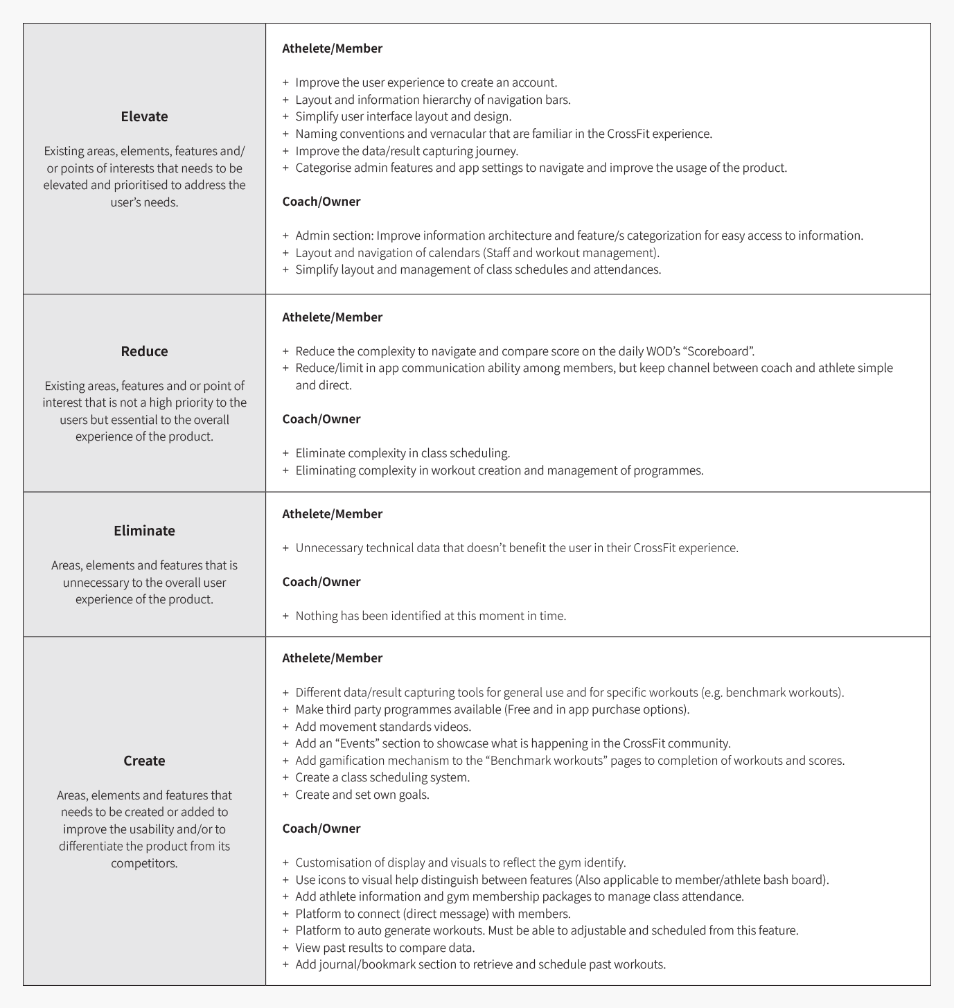
Brainstorming
Now that the core areas of opportunities have been identified, I started my brainstorming process.
To help me to structure and layout all my ideas and solutions, I categorised everything in the following four quadrants:
App Site Map
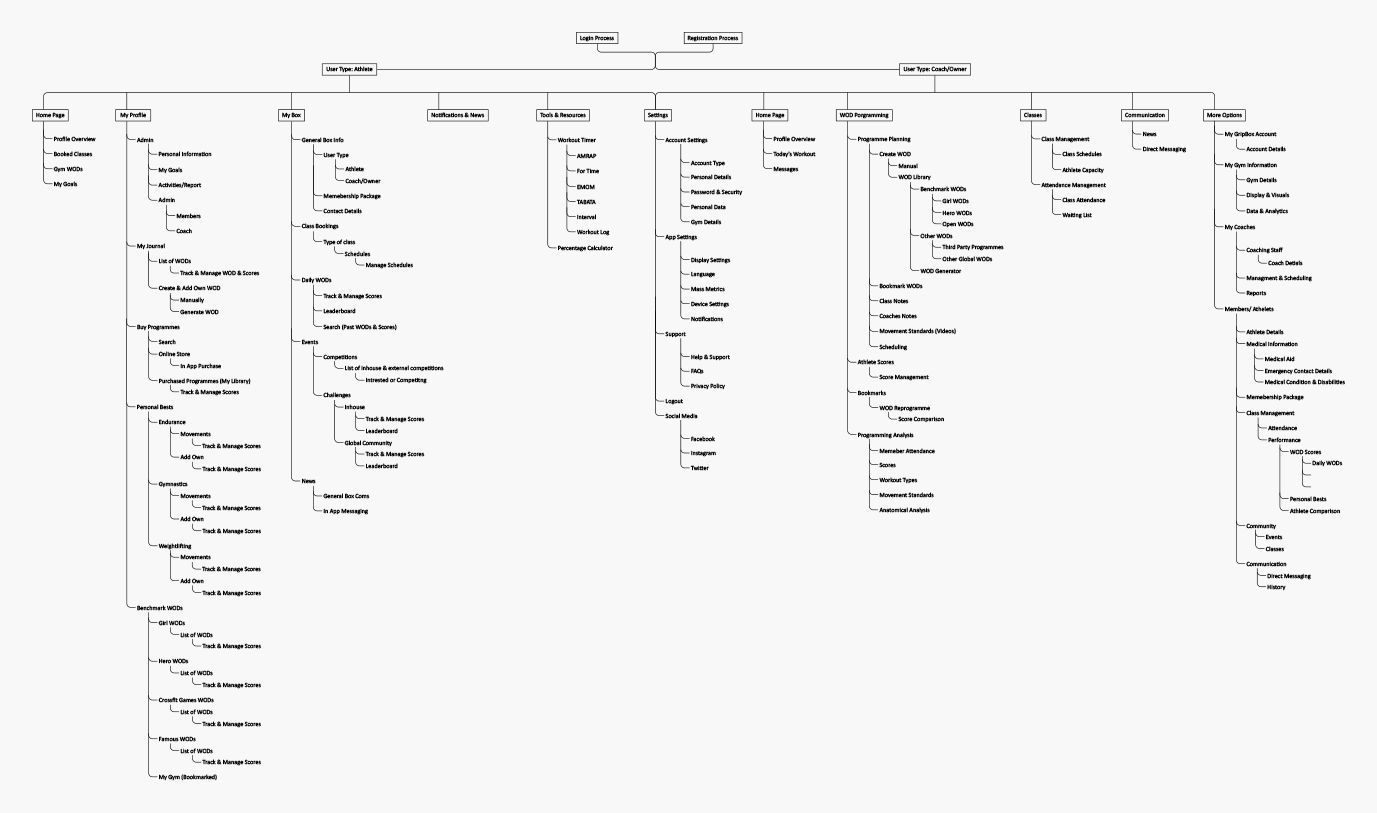
I completed my research and evaluation of the CrossFit industry/culture and ideal target audience’s needs. Based on this categorised information I put together a sitemap for the app. This sitemap helped me visually structure the app’s content, information hierarchy, how the pages interconnect with one another and to identify any gaps and opportunities.
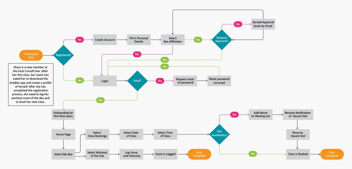
User Flow
With a broad overview of the app’s structure, I wanted to delve deeper into how my new persona, Ben, will logically navigate the app in order to complete the two primary tasks (Book a class and log a score). From a user perspective, I laid out a user flow diagram that helped me to better understand the interactions, the key steps needed and the decisions that might be taken in order to accomplish a certain task/s performed with the app.
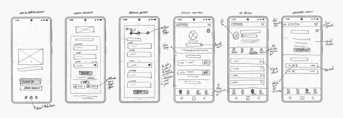
Low-Fidelity Wireframe Sketches
Based on the steps completed thus far, I started sketching out low-fidelity wireframes to both, develop suitable solutions that address our target audience’s needs and meet certain project goals.
One of the key areas I focused on during the sketching phase of the project, is the grouping of buttons, their placements, and the usage of different navigation bars in order to elevate the overall navigation, usage, and user experience of the app.
PROTOTYPE & TESTING
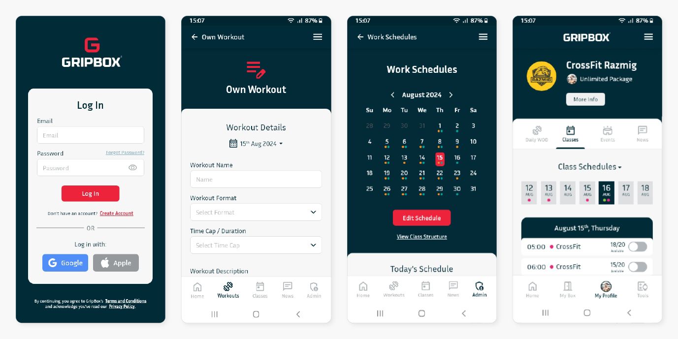
Mid-Fidelity Wireframing
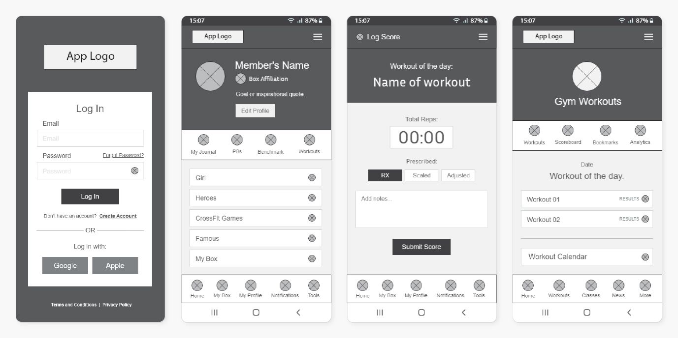
Using Adobe XD, I transferred my ideas and potential solutions onto a digital platform to create key mid-fidelity wireframes. By developing mid-fidelity wireframes, I was able to further refine my initial design solutions, the functionality, layout, and the user journey, before I went on to the user testing phase of the project.
Usability Testing
For the usability testing session, I developed a list of questions and tasks that participants were asked to complete. Participants included a mixture of gym owners, coaches, athletes (varying in fitness and objectives).
Throughout the session, participants were asked to think out loud and to share their feelings and thoughts while they completed the tasks.
Test Objectives
- Test if users can easily complete certain tasks.
- Observe how users navigate the app.
- Assess potential areas and features to improve the usability of the app.
- Identify any additional insights that will improve the product.
Tasks
To test both the front end and the admin side of the GripBox app, I created two sets of task lists that was assigned to certain participants to complete during the session.
Below is a list of some of the tasks participants were asked to completed:
Coaches/Owners
- Switch between a member and admin dashboard.
- Schedule a benchmark workout.
- Create your own workout and schedule for a particular date.
- Change and rearrange the coaching schedule.
- Create a message and send to your gym members.
Members/Athletes
- Book a spot in a class.
- Log your score for a workout and see how you placed compared to your fellow gym members.
- Find a certain third-party CrossFit programs.
- Find the clock for an EMOM workout.
- Find out what was your personal best was for a Benchmark workout.
Overview
Method: In field, moderated usability testing (Think Aloud)
Participants: 10 (4x Owner/Coaches, 2x Novice Athletes, 2x Intermediate Athletes, 2 x Elite Athletes)
Average time: 10-20 minutes
Task Completion Rate: 90%
Outcome & Revisions
Based on the outcome of the usability testing session, my overall recommendations and design solutions where well received. However, there were a couple areas, patterns and comments made by the participants. These findings helped me to improve and further refine the usability of the design.
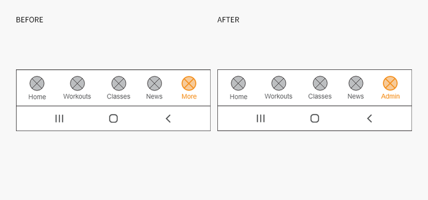
On the Coach/Owner main baseboard, change the “More” button to “Admin.”
During the testing phase, participants were asked to find certain features that were located under the “More” button. Upon observation, participants showcased similar navigational patterns to locate these features in the side navigation drawer (Hamburger Icon) as opposed to going directly to the “More” button in the main navigation bar. After a couple of failed attempts participants where able to find the features in question. Although the participants felt it was obvious why it was placed under the “More” button, some of the participants suggested to change the name of the button to “Admin”, as they feel it is more relevant to the content of this section.
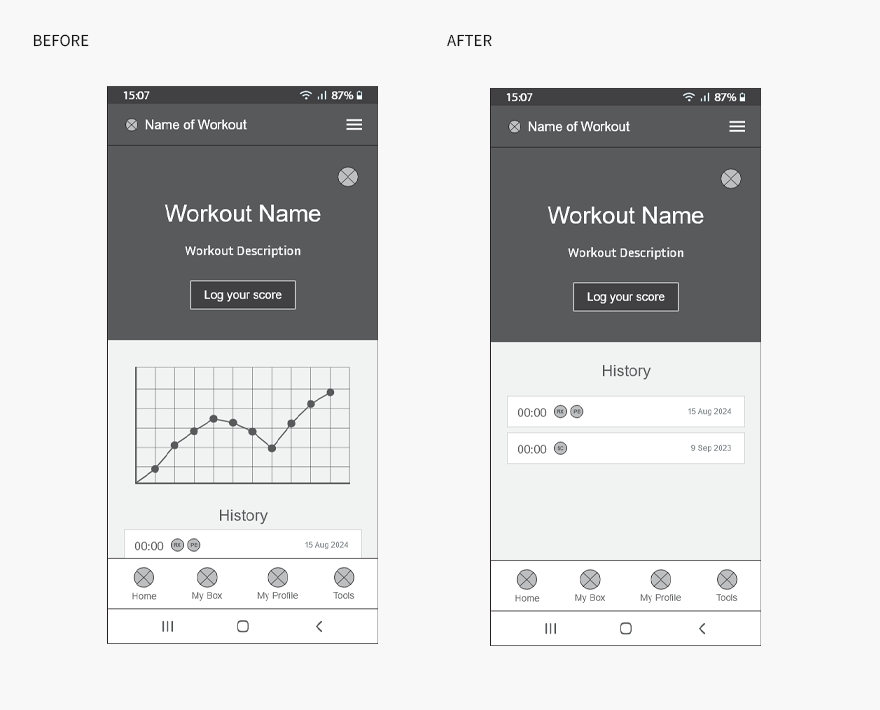
Remove visual representation of data.
On the Benchmark Workout pages, seventy percent of the participants, especially participants that where novices or intermediate athletes, thought that a visual representation of their results on a graph was not necessary and they felt it could be removed.
Upon further investigation, it came to light that although participants like to see their progress in a log book style, a visual representation of their data served no value to them and in some cases, participants view the graph as demotivating - especially if there is a decrease in their progress. As a solution the graph will be removed, and as an alternative a personal best gold badge will be designed during the UI design phase, to highlight the best result logged for a particular workout, no matter the time or the intensity.
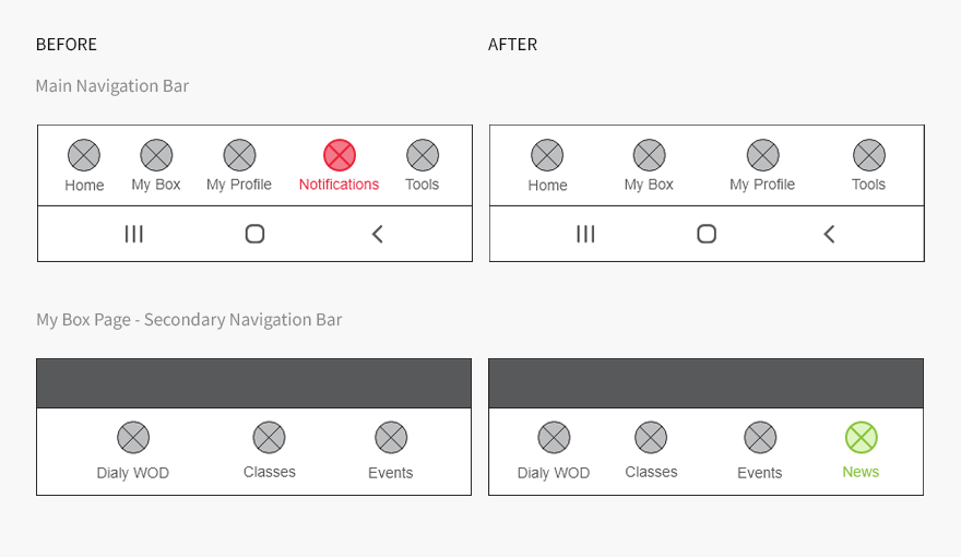
Remove “Notifications” button from the main navigation bar.
One of the key findings was: Users wanted to stay informed of any news & information regarding their gym. Based on the importance and relevance of this insight, I initially placed the “Notifications” button in the primary navigation bar. However, during the testing phase, the naming and placement caused a bit of confusion among most of the participants. Participants were not sure if this feature was related to their gym or the app. To solve this, I changed the name of the button to “News” and I moved the button to the secondary navigation bar in the “My Box” section.
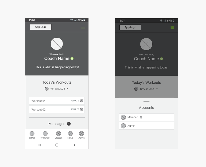
Allow more options to switch between member and coach/owner dashboards.
One of the tasks that participants were asked to perform, was to switch between the member and the coach/owner dashboard. Sixty percent of the participants did not know how or where to go to perform the action, while other participants could easily complete the task. As a solution, I added an additional user path option to the main header section of the home page. I placed an arrow next to the heading “Member” that opens a bottom sheet that enables a user to switch between the two dashboards.
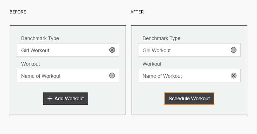
Change the button name “+ Add Workout” to “Schedule Workout”.
During the testing phase, participants were asked to add a benchmark workout to a specific date on the calendar. Although participants could easily complete the task, one thing that caused hesitation during the process where the name of the button, “+ Add Workout”. Some participants thought that “+ Add Workout” was to add a section onto the existing page. Although in context this does not make any sense, participants then assumed that this must be the button, as this was the only button on the page to perform the action. As a solution, I changed the name of this button to “Schedule Workout”. This change was implemented across other pages that required a similar call to action.
BRAND & IDENTITY DEVELOPMENT
Branding
Before working on the user interface design of the GripBox app, I wanted to create a modern brand identity that expresses the product’s unique brand personality and to evoke a certain feeling/perception throughout the user experience of the app. The goal was to create a simplistic, modern, established, look and feel with the essence of Crossfit.
Mood Board
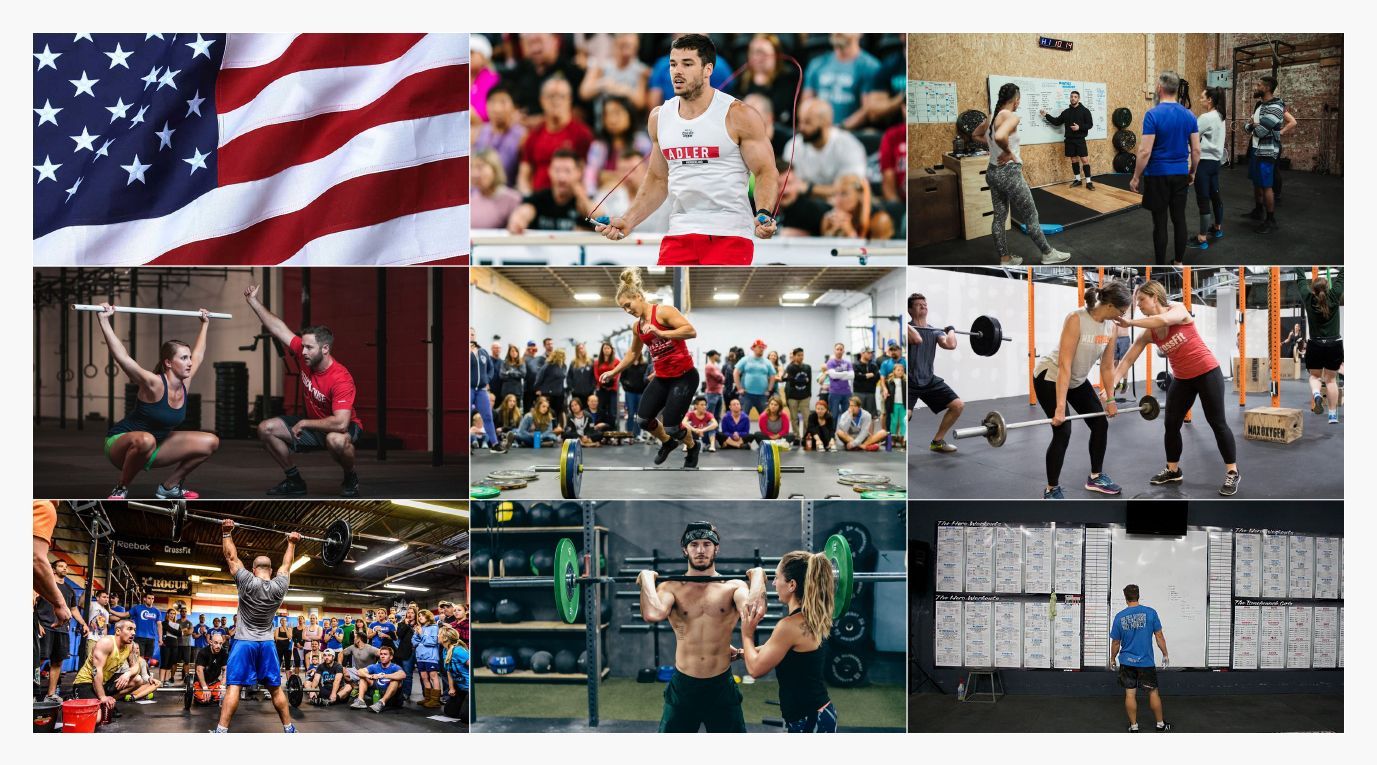
I compiled a mood board to serve as inspiration and to determine the direction for the brand identity that I wanted to create. I drew inspiration from various parts of the CrossFit culture/experience and origin of the sport.
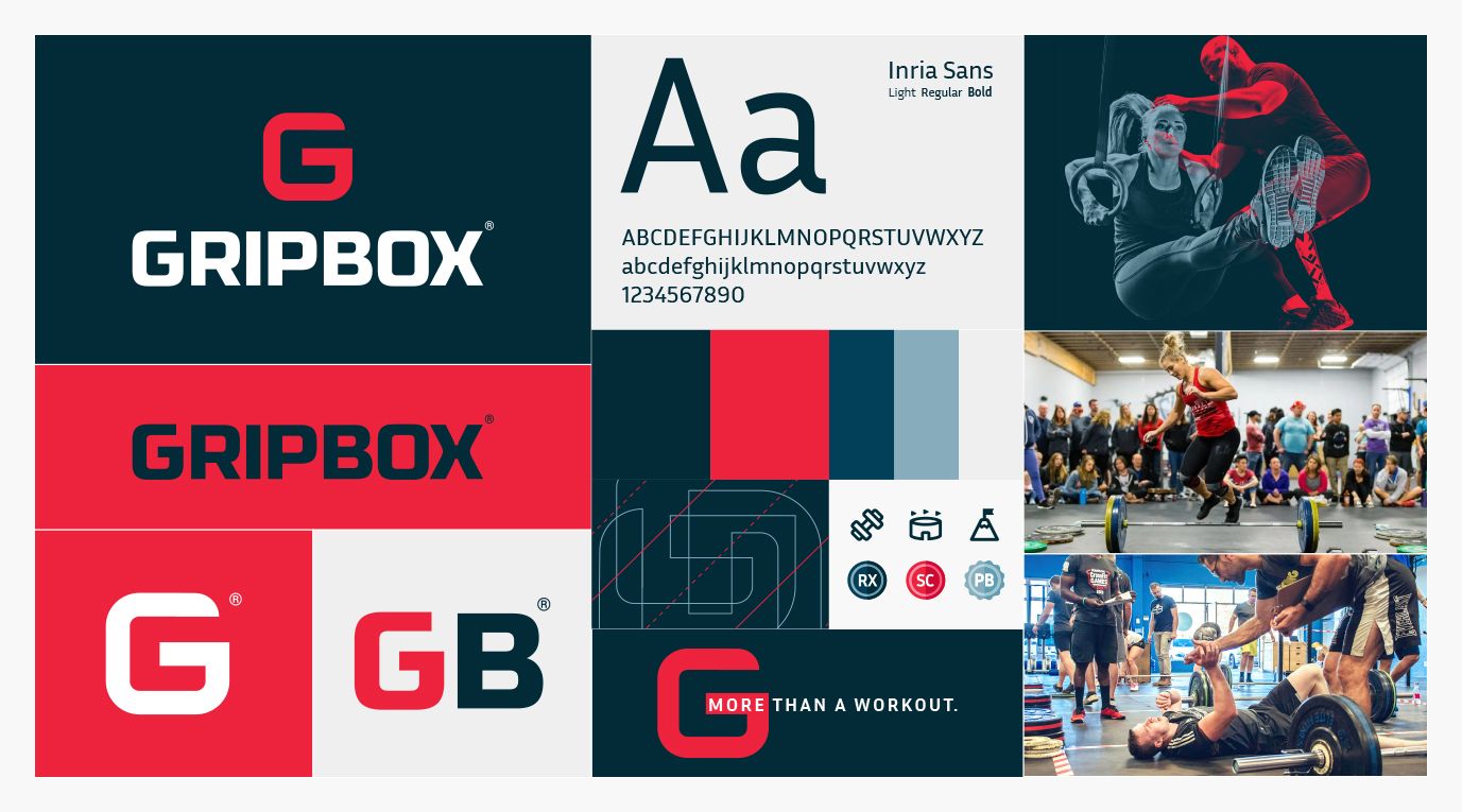
Logo Development
With my mood board completed, my next step was to design a logo/symbol that captures the essences of the product and what it stands for in the market.
While brainstorming different ideas, I kept three criteria areas in mind to ensure I met my objective:
- First, I wanted to create a unique symbol/logo that is agile enough to be applied across various platforms and in different sizes.
- Secondly, the symbol/logo must be easily recognisable and must visually stand out from its competitors and among a variety of different apps on a mobile phone.
- And finally, the symbol/logo must depict the attributes and personality of the brand.
Additional Brand Elements
After crafting my final logo, I wanted to expand the brand’s visual identity by creating additional brand elements to support the logo and to further bring the business/product’s personality to life. Each visual brand element has been curated to support and create a certain type of perception in the mind of our target audience and to contribute to the overall visual experience of the product.
UI DESIGN
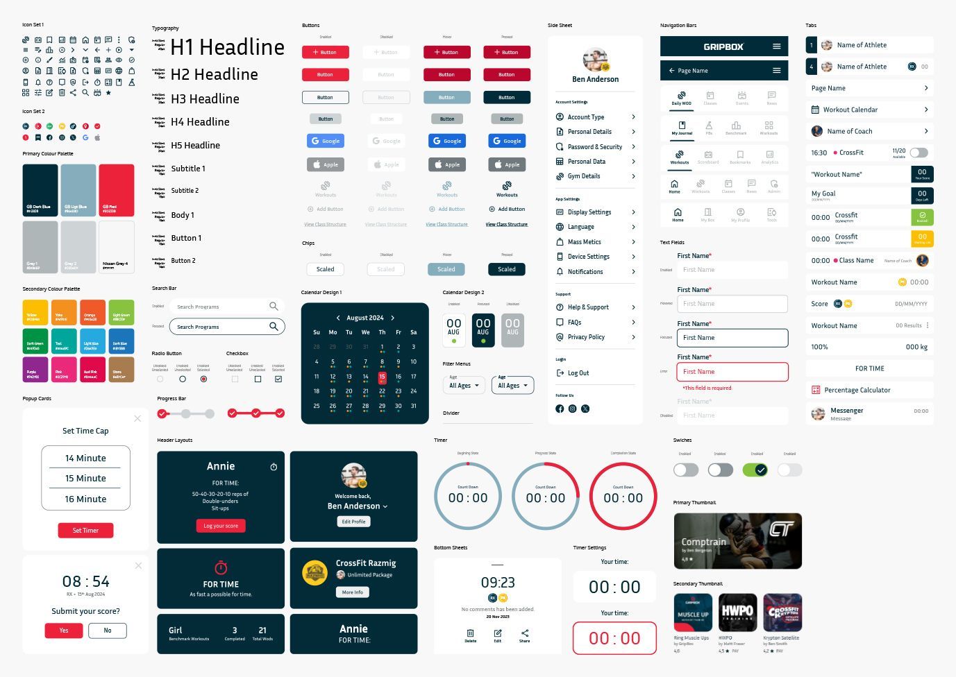
UI Toolkit
Using the brand identity as a guideline, my next step was to apply the visual style to the User Interface elements. The development of the User Interface Toolkit aided in creating coherency in the design and to bring the brand’s personality to live across the whole experience of the app. This User Interface Toolkit will also serve as a design reference document, if any additional elements may be needed in the future.
High Fidelity Wireframing
Next, I took my revised wireframes and incorporated my user interface toolkit in order to create high-fidelity wireframes that realistically simulate the final product. The high-fidelity wireframes helped all stakeholders involved in the project to visualize the product in detail.
Next Steps
During my case study, I only focused on certain areas that I identified as key differentiating factors/features that will help the GripBox app to stand out from its competitors. However, there are a couple of additional steps and unexplored areas that need attention that will further elevate and refine the user experience of the product.
1. Re-Testing
With my revisions from my previous usability testing session implemented and the brand’s visual style (UI components) applied, I want to conduct another usability testing session to validate the changes I made and to identify if there are any additional improvements and refinement needed before the project can go into development.
2. Push Notifications
Although this case study only focuses on the app itself, there are other unique features that did not go unnoticed. One of those features are the incorporation of push notification capabilities that could help to increase frequent usage of the app and to keep the app top of mind. The hypothesis that I would like to study is to find out if different types of push notifications, delivered with the right tone of voice at the right time, can increase app usage and classes attendance.
3. Integration
To elevate the user experience and encourage frequent usage of the GripBox app, I would like to explore the integrating of Smartwatch capabilities. There are certain features that I would like to focus on, for instance the capability to log time and to incorporate recording tools that help to bridge the gap between in the CrossFit experience (environment) and a mobile phone.
4. Added Features
Once the product is launched, I will monitor how the product is used, and continue to work on any updates needed to improve the app. In addition, I will also further explore potential new features or ideas to address future needs and to uphold the relevancy of the app.
Key Takeouts
With the case study completed, key takeouts were identified that played and integral part in the development of the GripBox app and served as key learnings for future product developments.
Strike the right balance between what is new and familiar.
During the design solutions and ideation phase, there where times where I got stuck exploring for alternative solutions to familiar features. As time went by, I needed to remind myself that you don’t always have to reinvent the wheel on every component of a new product. If you can improve the user experience and/or usage of a familiar feature/s and you can combine it with one or two new solutions that are relevant, a product has a good chance of being considered. It is creating a well-rounded product that strikes the right balance between what is familiar and what is new.
Environment/context can influence the relevance of the solution.
During my case study, I was once again reminded that, what people say they want and what they really need are two separate things. When I immersed myself in the culture and experience of the sport, I was able to conclude; that people’s emotions and their behavior within a certain environment can alter the relevancy of any recommended design solutions and influence the probability of product adoptions. By viewing the data through multiple “lenses”, I was able to identify clear patterns of what needs were important and what were not.
The power of a word.
One of the biggest things that stood out during the usability testing session, is the importance of choosing your words carefully. In the absence or misuse of a word/s within a particular moment in the user journey, the information or the intended action may be misinterpreted which could impede the users experience of the product.
